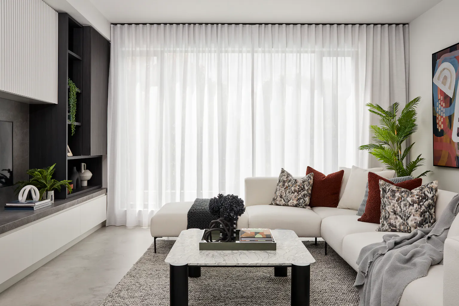
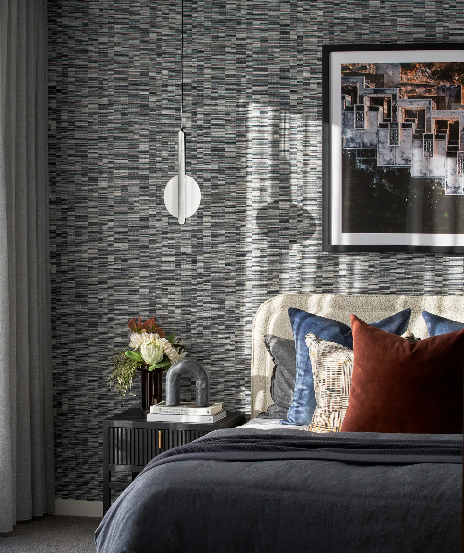
Every year, WGSN, the world’s leading consumer trend forecaster, compiles a list of the coolest colours they expect to make a big statement in the months ahead. We sat down with two of our interior design gurus – Kristina Orban and Felicity Tragardh – to talk about their thoughts on the key up-and-coming tones for the year ahead.
But first, we chatted about how best to use colour in your home more broadly. Kristina says the key to adding colour to any home is ‘everything in moderation’.
“We always add a splash of colour to our displays, but we use it sparingly and only as an accent. We build off a neutral palette and add hues like rust, apricot and green to bring a bit of life to our homes without it becoming too loud.”
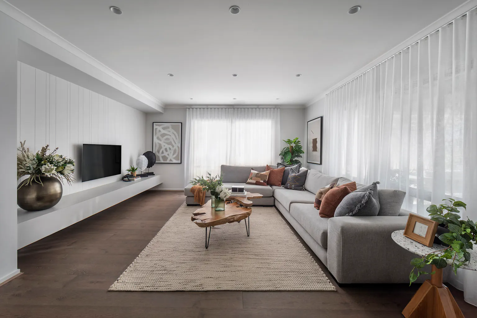
The great thing about using bold colours in small doses is that you can easily change up the look if you get bored or if trends change, Felicity adds.
“We add it in artworks, accessories and soft furnishings that can be moved or replaced without blowing the budget. It’s a bit like fast fashion, that way. Everything changes so much that you want to be able to keep up with the trends by swapping out cushions and accessories, rather than having to repaint a whole room.”
"Anything that’s fixed or fitted is costly to replace when you want a fresh look, but accessories achieve the goal with minimal outlay. That’s how you can have fun with the theme." Kristina Orban, Metricon Interior Designer
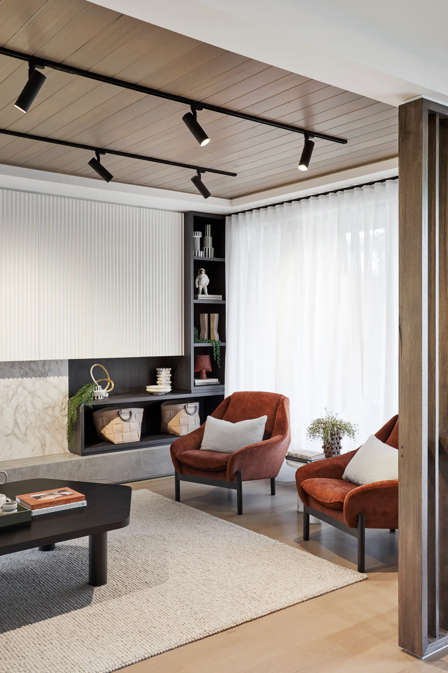
And if you want to spend a bit more on your main living area, Felicity suggests to use an occasional chair in a bold colour, but never the sofa. “Keep the sofa simple and classic, and introduce additional colour with throws and cushions.”
Kristina says you also need to decide what the room’s focal point is first. “Then it’s about pulling back on other areas, so everything’s not fighting to be the hero piece. The great thing is, with social media, everyone now comes with plenty of ideas in mind. Ten years ago, they didn’t have as clear a vision. Now everyone’s got Pinterest and Instagram, and they come in with beautiful mood boards.”
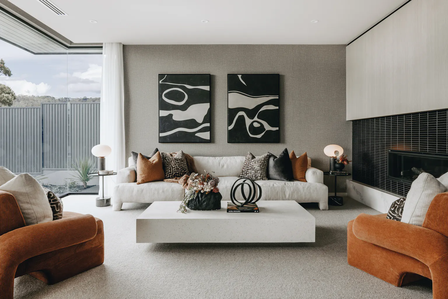
Here are three key colours to watch out for in 2023:
Apricot Crush
“This colour is one we often gravitate to,” Kristina says. “We’ll throw it in the mix to add warmth and complement more muted, softer colour palettes.”
"The great thing about Apricot Crush is that it can be used right across its spectrum, where we pick up on its lightest pastel shades, right through to its darkest, rusty-coloured ones," Felicity adds.
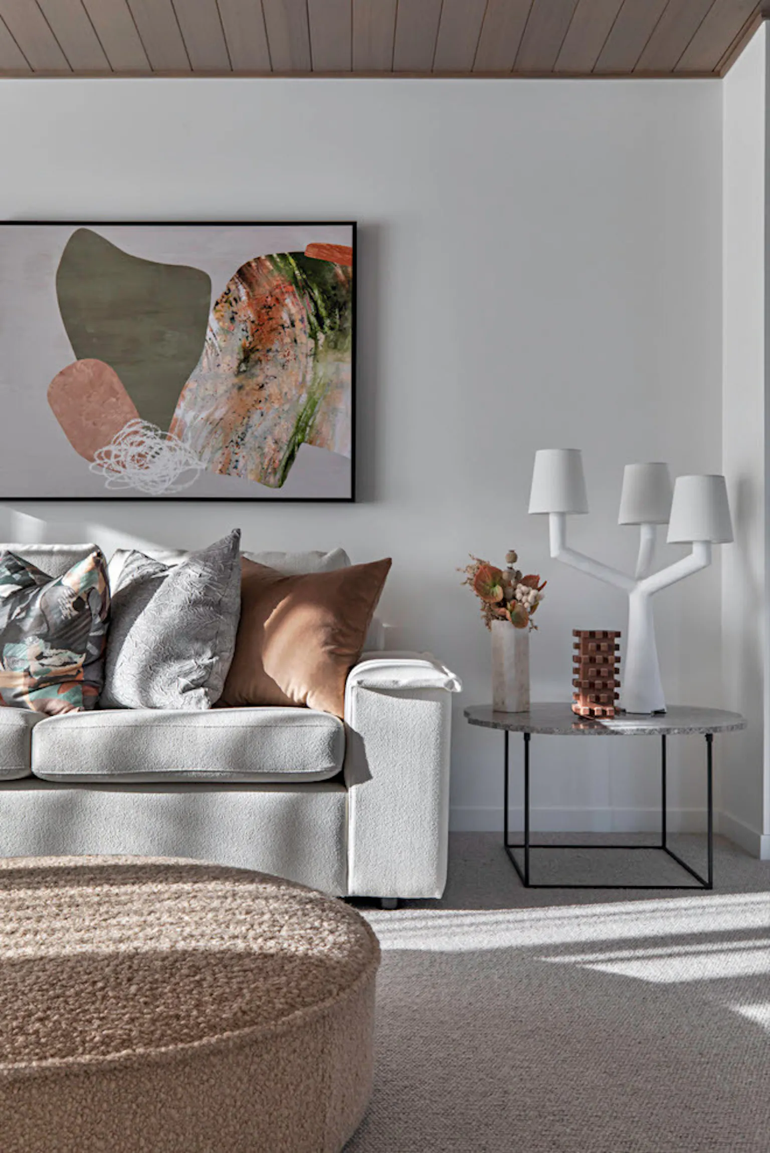
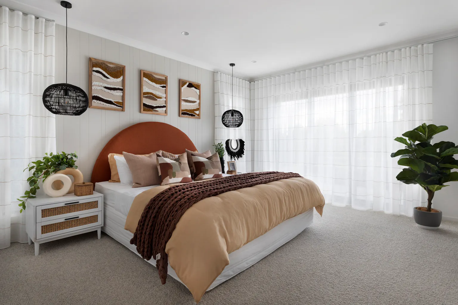
Cool Matcha
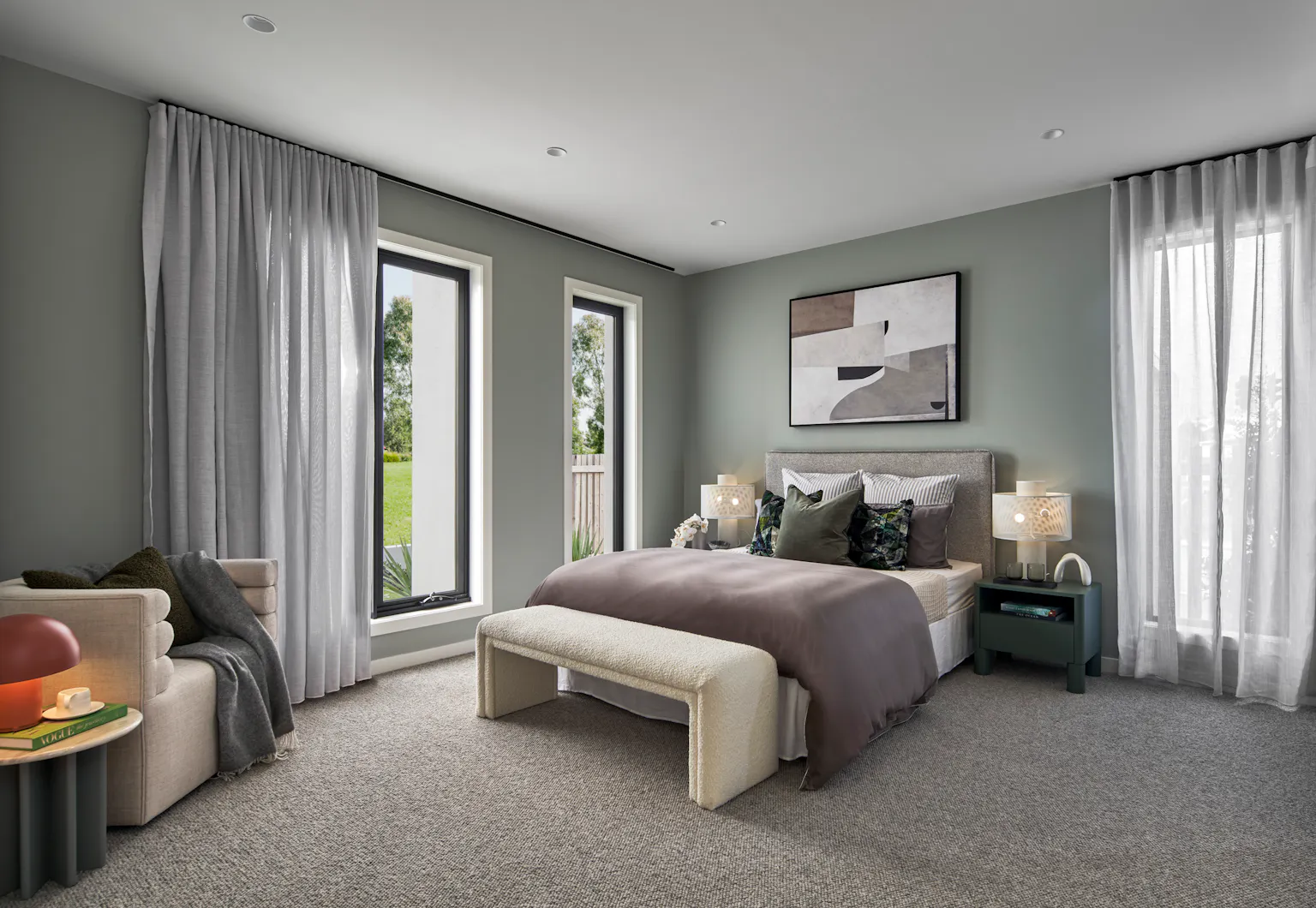
“We love to use green hues like Cool Matcha in our interiors,” Felicity says.
“The great thing is, it’s really easy to pick that up in floral arrangements that add a snippet of colour to a room. Adding greenery brings a sense of tranquility to a space, freshening and softening a room.” Felicity Tragardh, Metricon Interior Designer
Kristina agrees. “We love introducing that leafy, natural look, more so than dried flowers…even if they are artificial for the less green-thumbed among us who have busy lives.”
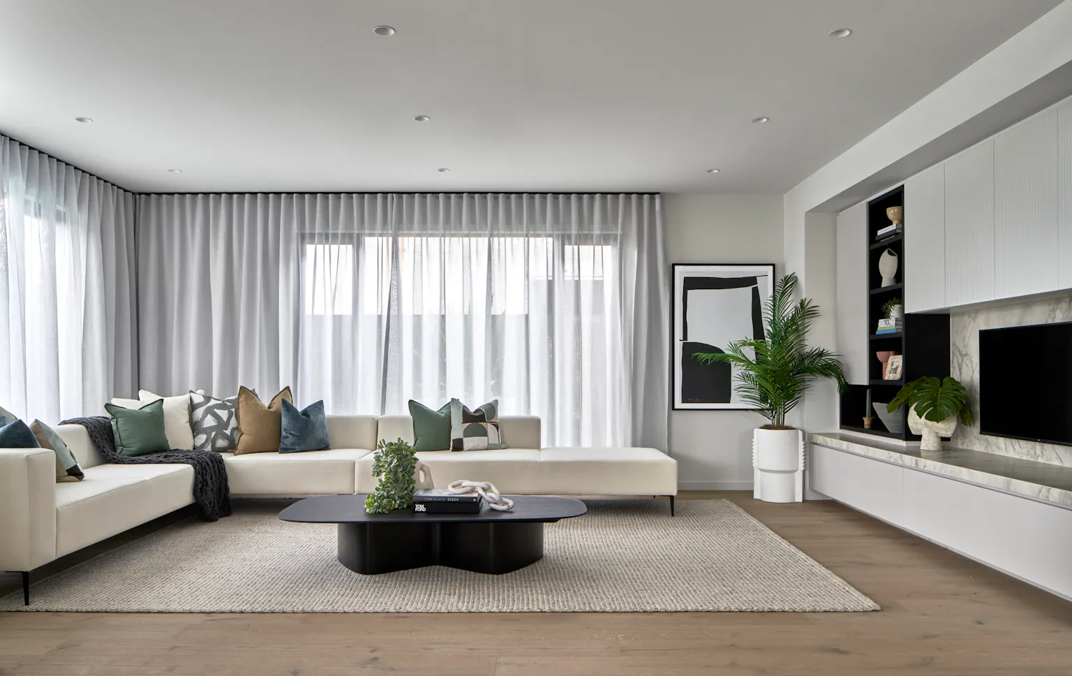
Intense Rust
“Intense Rust is a staple of Metricon’s colour palette that we will never get tired of using,” Kristina says. “It’s a neutral tone that works well in most interiors. It’s very versatile and can be applied to many different schemes, whether the overall look runs cool or warm. It can add to an earthy, rustic home or work in a high-end luxury one.”
